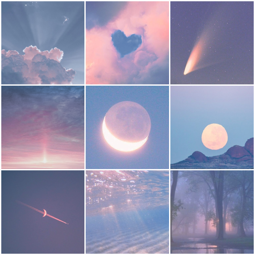
A pink and blue mood board is one of the most versatile color stories you can build. Soft blush meets cool sky, cotton-candy pastels sit beside deep navy, and suddenly a simple palette feels like sunrise over water. Whether you are planning a wedding, redesigning a bedroom, or curating a Pinterest-worthy brand identity, the pink and blue pairing gives you warmth and calm at the same time. Below are 15 tools, generators, and inspiration archives that make building a natural pink and blue mood board faster, prettier, and more original than a plain search grid.
Table of Contents(Click to Toggle)
Why Pink and Blue Mood Boards Work So Well
Pink and blue is not just a nursery cliche. It is a complementary pairing with a built-in temperature contrast: pink leans warm, blue leans cool, and the tension between them keeps a composition from feeling flat. Designers lean on this duo because it reads as romantic without being saccharine, and modern without being cold. The trick is choosing your version of the pairing. A dusty rose with slate blue feels editorial and muted. Hot pink with electric blue feels energetic and pop. Blush with powder blue feels soft and natural, which is exactly why so many wedding, skincare, and stationery brands default to it.
The harder part is collecting references that actually match your specific shade choices. A generic image search gives you whatever is trending, not what fits your palette. The tools below solve that problem in different ways, from palette generators that lock in hex codes to curated archives where the pink and blue combinations are already vetted.
15 Pink and Blue Mood Board Tools and Inspiration Sources
1. Coolors : Instant Pink and Blue Palette Generation
What it is: A fast browser-based color palette generator with a dedicated palette explorer.
Category: Color palette tool
Why it stands out:
- Press the spacebar and it generates a fresh five-color scheme instantly
- You can lock a pink swatch, then reshuffle until the blues cooperate
- Exports palettes as PNG, PDF, or copyable hex codes for your mood board
Best for: Anyone who needs exact hex codes before they start collecting images.
2. Pinterest : The Largest Visual Archive for Color Pairings
What it is: A visual discovery engine built around boards and saves.
Category: Inspiration platform
Why it stands out:
- Searching “dusty pink and navy aesthetic” surfaces hundreds of real boards
- Sectioned boards let you split one mood board into palette, texture, and typography
- The visual similar feature finds shades you would never have typed into a search bar
Best for: Early-stage collecting when you do not yet know your exact shades.
3. Adobe Color : Extract Palettes From Any Photo
What it is: Adobe’s free color wheel and palette extraction tool.
Category: Color extraction tool
Why it stands out:
- Upload a photo of a pink sunset over blue water and it pulls the exact five shades
- Harmony rules like complementary and split-complementary keep pairings balanced
- Saved palettes sync into Adobe libraries for later use in Illustrator or Photoshop
Best for: Designers who already work inside Adobe apps.
4. Canva : Build the Board Without Leaving the Browser
What it is: A drag-and-drop design platform with mood board templates.
Category: Design and layout tool
Why it stands out:
- Thousands of free mood board templates sized for print or screen
- Color palette feature applies your pink and blue hex codes across every element at once
- Free tier covers most personal mood board projects without a subscription
Best for: Beginners who want a finished, shareable board in under an hour.
5. Design Seeds : Curated Photo-Based Color Stories
What it is: A long-running blog archive of photo-derived color palettes.
Category: Curated palette archive
Why it stands out:
- Every palette is paired with the source photo, so you see the colors in context
- Soft pink and blue combinations appear constantly in the nature and sky categories
- Palettes are grouped by hue, making it easy to browse only the blue-adjacent sets
Best for: People who want natural, unforced color combinations rather than synthetic ones.
6. Color Hunt : Trending Four-Color Combinations
What it is: A community-curated gallery of four-color palettes.
Category: Palette gallery
Why it stands out:
- Filter by “pastel” to immediately surface soft pink and blue sets
- Palettes are voted on, so the most usable combinations rise to the top
- One click copies the hex codes with no account required
Best for: Quick palette grabs when you already know the vibe you want.
7. Behance : Professional Projects Built on These Palettes
What it is: Adobe’s portfolio network for creative professionals.
Category: Portfolio and case study platform
Why it stands out:
- Search “pink blue branding” and you get full identity systems, not just swatches
- Case studies show how the palette was applied to packaging, web, and print
- Seeing finished work helps you judge whether a pairing holds up at scale
Best for: Brand designers validating a palette before committing.
8. Unsplash : High-Resolution Source Photography
What it is: A free stock photo library with a permissive license.
Category: Free image source
Why it stands out:
- Search “pink sky blue sea” for natural pairings that never feel staged
- Downloaded images can be dropped straight into Adobe Color for extraction
- No attribution required, which keeps mood boards clean and uncluttered
Best for: Sourcing hero imagery for a board without licensing headaches.
9. Milanote : A Canvas Built Specifically for Mood Boards
What it is: A visual note and project planning tool with an infinite canvas.
Category: Mood board workspace
Why it stands out:
- Drag images, color swatches, links, and text anywhere on the board
- Free tier allows unlimited boards, which is rare for this category
- Boards can be shared with a client as a read-only link for feedback
Best for: Freelancers presenting mood boards to clients.
10. Dribbble : Interface and Graphic Color Inspiration
What it is: A showcase platform for digital designers.
Category: Design inspiration gallery
Why it stands out:
- Search by color to find shots tagged with specific pink and blue values
- Strong for UI palettes, gradients, and illustration styles rather than photography
- Each shot lists the designer, so you can follow people whose color sense matches yours
Best for: Web and app designers building a digital-first palette.
11. Colormind : AI Palettes That Learn From Real Design
What it is: A deep-learning color palette generator trained on photographs and art.
Category: AI palette generator
Why it stands out:
- Lock your pink, then let it predict a harmonizing blue and two neutrals
- Can generate palettes directly from an uploaded image
- Outputs are consistently muted and usable, not neon experiments
Best for: Anyone stuck on which third and fourth colors to add.
12. Are.na : Ad-Free, Thoughtful Visual Collections
What it is: A quiet, community-built platform for collecting and connecting ideas.
Category: Curation platform
Why it stands out:
- No algorithm and no ads, so the aesthetic stays consistent across a channel
- Users build channels like “soft pink and blue” that read like curated exhibitions
- Blocks can be images, text, or links, making it a genuine research tool
Best for: Creatives who find Pinterest too noisy and commercial.
13. Paletton : Classic Color Wheel Theory Tool
What it is: A long-standing color scheme designer based on the traditional color wheel.
Category: Color theory tool
Why it stands out:
- Shows your palette applied to a sample web page layout in real time
- Adjacent and triad modes reveal pink-blue pairings you would not guess manually
- Includes a color-blindness simulator, which matters for accessible design
Best for: Designers who want theory behind the pairing, not just vibes.
14. Pexels : Free Photos and Video for Boards
What it is: A free stock library covering both stills and short video clips.
Category: Free media library
Why it stands out:
- Video clips let you build motion mood boards, not just static grids
- Strong collection of pastel florals, water, and sky imagery in pink and blue tones
- Simple license with no attribution requirement for most assets
Best for: Social media creators who need moving mood board content.
15. Figma : Collaborative Boards With Live Feedback
What it is: A browser-based interface design tool with freeform canvas files.
Category: Collaborative design tool
Why it stands out:
- Frames work like artboards, so one file can hold palette, imagery, and type studies
- Comments let a client point at a specific swatch and respond directly
- Free plan includes unlimited personal files and three collaborative files
Best for: Teams that need one source of truth for a visual direction.
Bonus: Khroma : Trains on Your Own Color Preferences
What it is: An AI color tool that learns from fifty colors you personally select.
Category: Personalized palette generator
Why it stands out:
- After training, every generated palette reflects your taste rather than a generic average
- You can browse palettes by type, including soft and pastel groupings
- Entirely free and runs in the browser with no account needed
Best for: People who keep rejecting every palette they find.
Bonus: Muzli Colors : Palettes From Real Product Design
What it is: A palette generator that pulls color schemes from popular apps and websites.
Category: UI color reference
Why it stands out:
- Every palette is attached to a real product, so you see it working in context
- Includes a live preview of your palette on a mock interface
- Useful for checking whether a pink and blue pairing survives on small screens
Best for: Product designers choosing UI colors.
Bonus: ColourLovers : A Community Archive Since 2004
What it is: One of the oldest color community sites, with millions of user palettes.
Category: Community palette archive
Why it stands out:
- Two decades of user-submitted palettes, searchable by keyword and hue
- Palettes come with names and stories, which is oddly useful for naming a project
- Free to browse and save without an account
Best for: Deep archive digging when current trends feel repetitive.
Bonus: Niice : Search Multiple Design Sources at Once
What it is: A mood board tool that aggregates results from several design platforms.
Category: Aggregated inspiration search
Why it stands out:
- One search pulls from Behance, Dribbble, and other libraries simultaneously
- Boards can be private, shared, or embedded for client presentations
- Color filtering narrows results to your exact pink and blue range
Best for: Saving time when you would otherwise open five tabs.
Building a Mood Board That Actually Gets Used
The best pink and blue mood board is not the prettiest one. It is the one you keep returning to when you are choosing paint, approving a print proof, or picking a hero image at eleven at night. That means your board needs to do two jobs: capture the feeling and record the specifics. Pair an inspiration tool like Are.na or Pinterest with a palette tool like Coolors or Adobe Color, and keep the hex codes written directly on the board. If you are building for a client, Figma or Milanote gives you a shareable link and a comment thread, which turns a mood board from a static image into a conversation.
One practical tip that saves hours: collect twenty images before you judge anything. The first five will be whatever is trending, and the real direction usually shows up around image fifteen. Then strip out anything that does not share at least one shade with your core palette. What remains is usually a tighter, more honest visual story than anything you could have planned from scratch.
Which pink and blue pairing have you been collecting lately, dusty rose and slate, or something bolder? Share your favorite find in the comments.